Google’s Material design guide will make you a better designer
Blog
Read the guide. Learn things.

At their I/O Conference Google released a new look for Android. It’s beautiful, tying in a paper and ink style along with smooth animations designed to enhance the understanding of content. It’s not just a visual skin, it’s much more.
Windows Metro and iOS 7, are both great in their own ways, but their focus is narrow. The Material Design language can apply across any digital medium and even print – and it does it well.
The guide brings together a comprehensive visual style along with the reasons and insights behind it. With a background in graphic design and print, there are many rules in here I know well. There is also quite a few that were new to me.
The Material design guide goes from the well established design rules governing typography and grids, right through to the latest techniques for responsive design and introduces new best practices for animations and shadows that apply to android, websites, digital signage (check out this open source digital signage software) and even print.
For every designer and developer it is worth a read
Here are some of our favourites
Typography
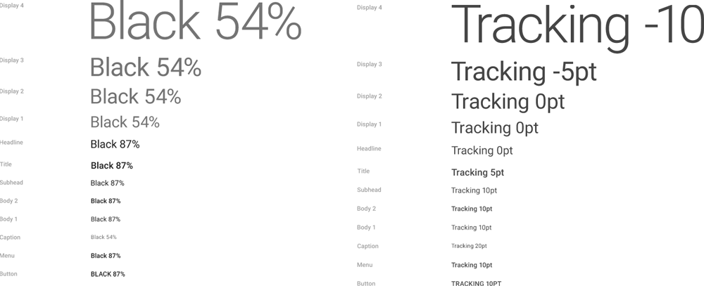
note that all text isn’t completely black.
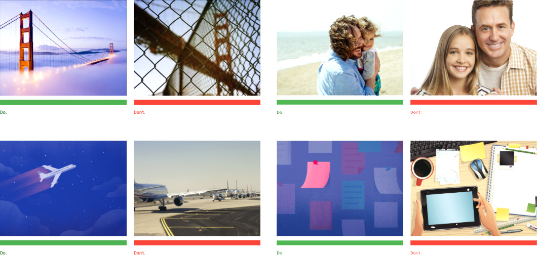
Images
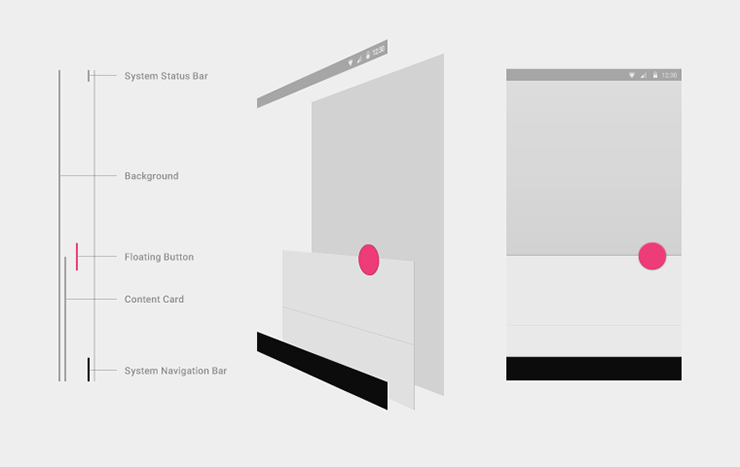
Shadows
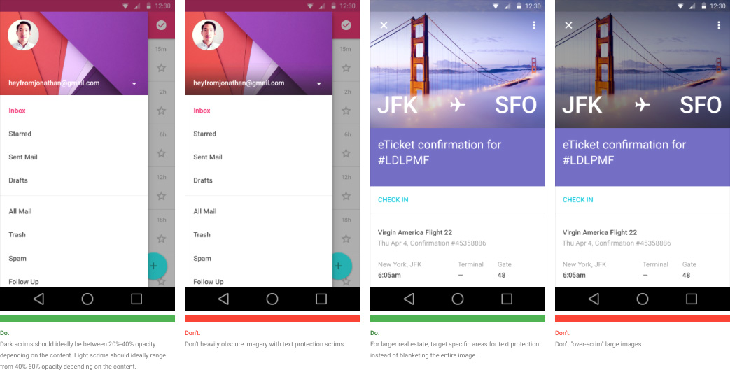
Text Protection
A great future for Android
In the past, the design of Android and apps on it has been a mess, with hundreds of screen sizes and device styles and no way to match the consistency of other operating systems. Now, from a website right down to a phone Google has created a language that encompasses them all with techniques that can make you a better designer on every project.
Go read the full document right now. Watch every example, love every do and don’t.
